Understand the brand
We review the audience, brand goals, existing artwork and intended touchpoints.
Type a keyword to search.
A consistent, print-ready visual identity from your logo to your packaging.
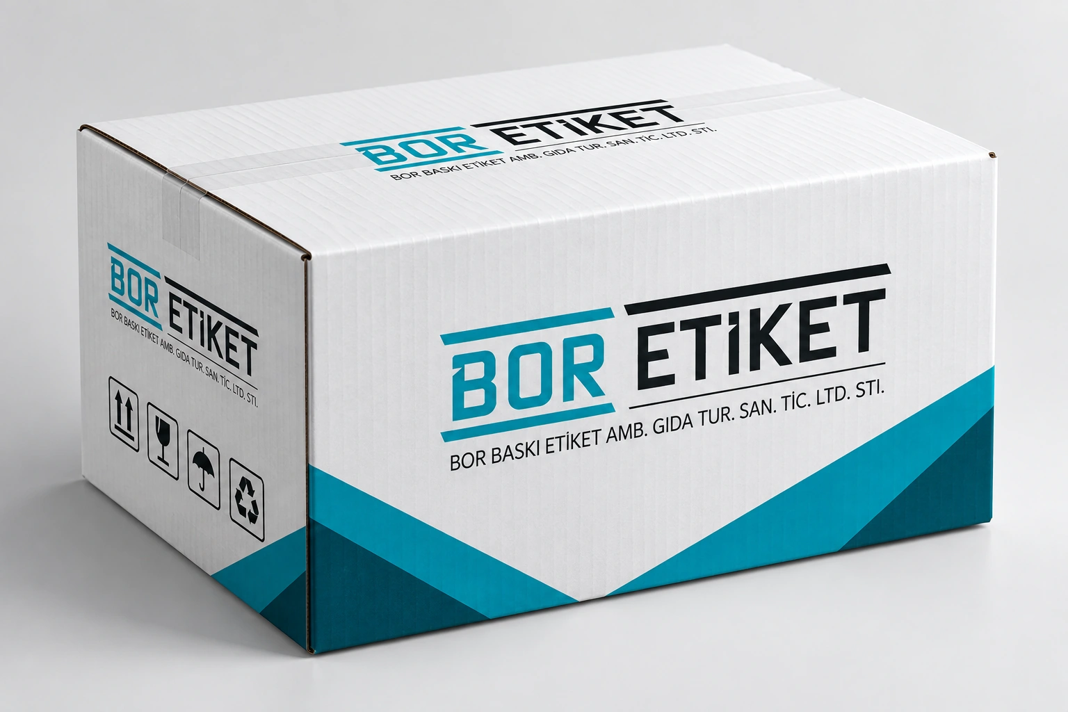
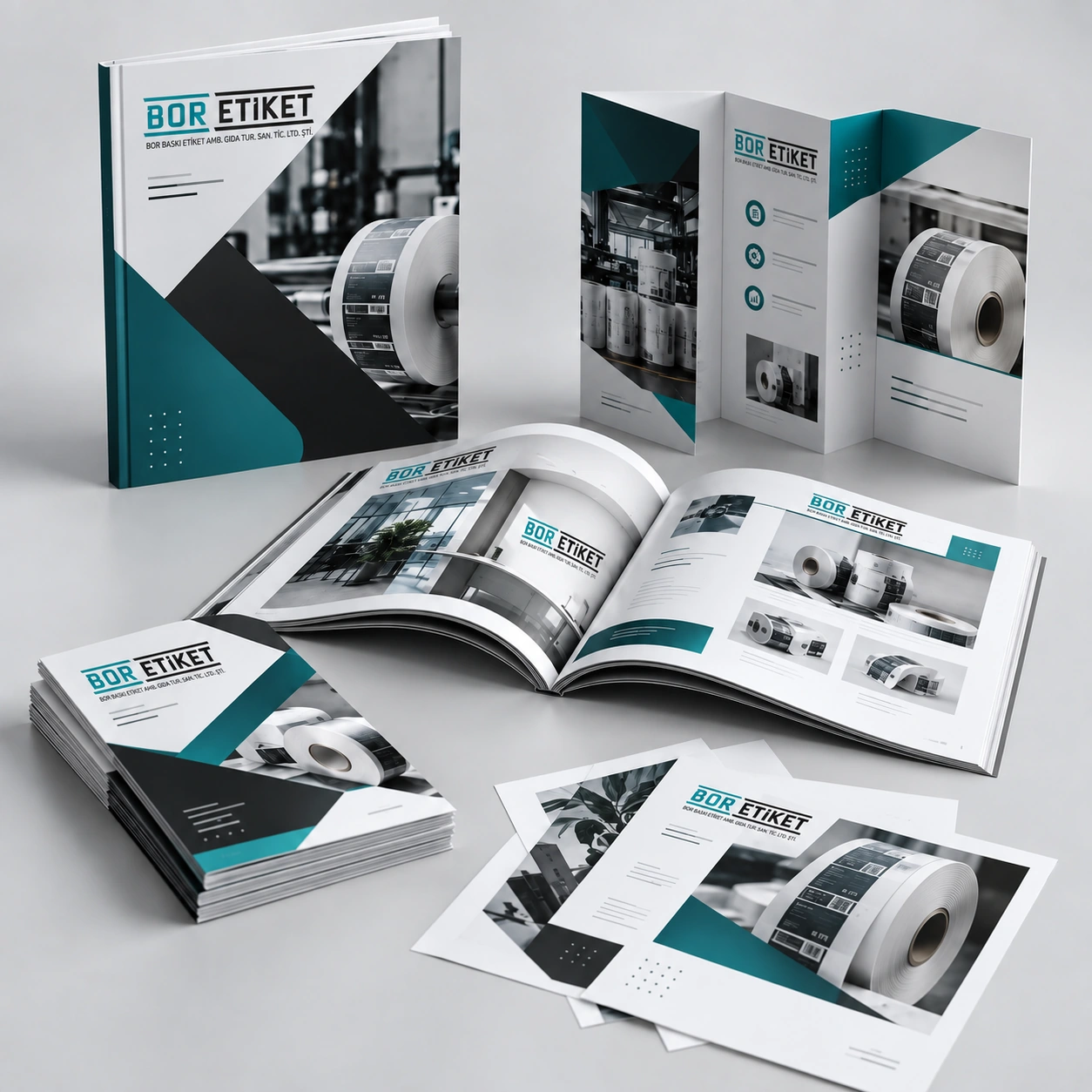
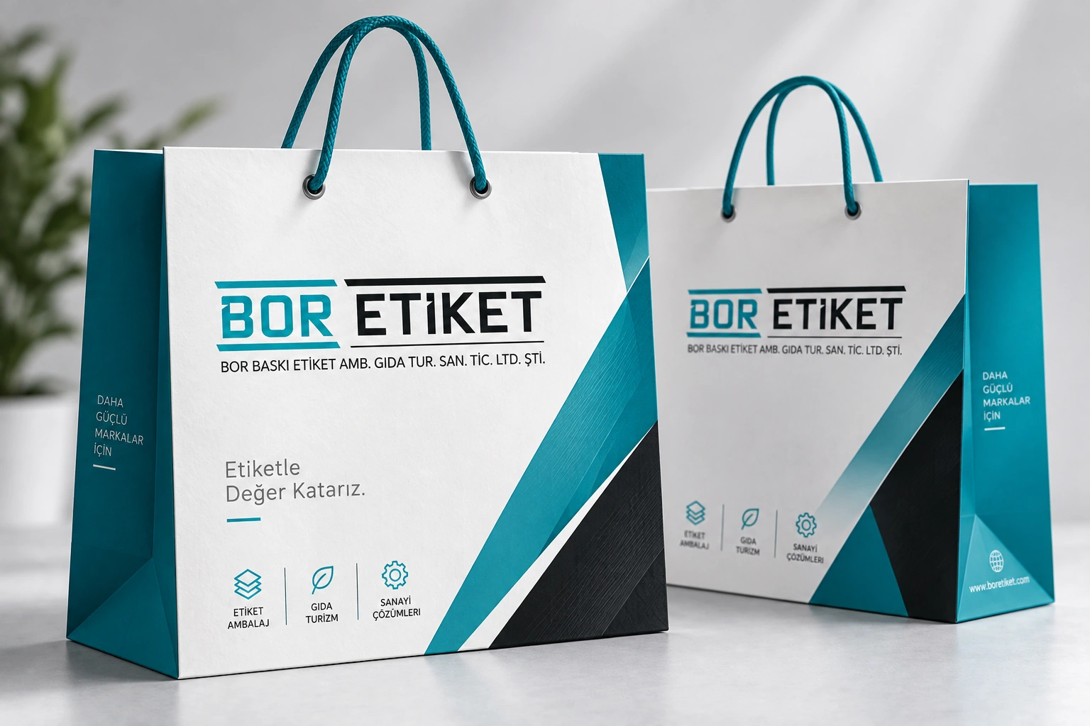
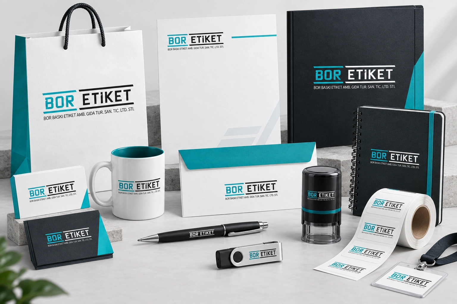
An identity is more than a logo. Colour, typography and usage rules should express the same brand on a business card, label or box. We consider the intended surfaces and print conditions alongside the artwork.
We can adapt an existing identity to printed applications, or define the scope and requirements of a new project together.
We review the audience, brand goals, existing artwork and intended touchpoints.
Logo placement, colour, typography and sample applications are developed as one visual language.
Approved artwork is prepared for the intended size, bleed, colour profile and substrate.
Logo treatment across backgrounds, clear space and core colour decisions.
Business cards, letterheads, presentation folders and related print pieces.
A coherent identity across labels, boxes and paper bags.
Share your current logo files, brand colours, examples and the products where the identity will appear. We can then agree on the deliverables.
Yes. We can use an existing logo and brand guidelines as the starting point for print applications.
Substrate and print method affect appearance. Approved samples on the intended material help with colour-critical work.
Vector logos, brand colour codes, typeface details and previous artwork are helpful when available.